The images we publish carry as much of the ELIXIR-UK voice as the words. This page sets out where to find them, what they should look like, and what to avoid.
For the writing-side rules on alt text and image placement, see Writing a webstory → Banner image and alt text. For accessibility, see Accessibility.
Choosing the hero image
Three on-brand options. The choice depends on what the piece is about.
- Isometric illustration (our licensed set, see below) – for conceptual stories, reports, slides, posters, newsletters and evergreen content where a specific photograph would be wrong or unavailable.
- Abstract photography – the default for news banners about concepts, papers, services or topics where there is no specific “real moment” to show. Think images that suggest connection, data, networks, structure or scale.
- People photography – when the story is about real people, events or work in progress. Member spotlights, event recaps, fellowship updates, partnership news.
Isometric illustrations
ELIXIR-UK holds a licensed set of isometric illustrations used as hero imagery across reports, the website, newsletters, posters, slides and even the Zoom waiting room. They’re the most recognisable ELIXIR-UK visual element after the logo.
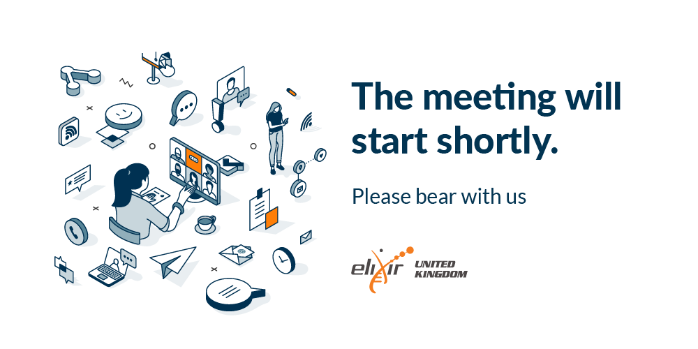
Example: the ELIXIR-UK Zoom waiting room, built on the licensed isometric set.
When you use the isometric set:
- Keep the navy + orange palette. Don’t recolour to other hues.
- Don’t combine with heavily competing imagery. The isometric works best with clean text and generous space.
- Don’t create AI-generated lookalikes. If a specific scene isn’t in the set, contact the team.
Other illustration
Beyond the isometric set, illustration is used sparingly. Examples: simple diagrams, schematics, conceptual visuals where a photograph or isometric isn’t right.
When other illustration is used:
- Flat, geometric, brand-coloured. No skeuomorphic shading, no faux-3D.
- From the ELIXIR brand palette, or close colours if more variants are needed (see Colour).
- Vector (SVG) where possible – scales, accessible, lightweight.
Photography direction
Two modes, both on-brand: people photography (for real moments and named subjects) and abstract photography (for concept-driven news banners). Different rules for each, same edit treatment.
People photography
- Real people doing real work. Researchers at screens, conversations between members, hands on keyboards, faces in discussion. The work, not the institutional pose.
- UK contexts where possible. University environments, research labs, UK conference venues. Authentic over aspirational.
- Candid over staged. A genuine moment of attention beats a posed handshake.
- Natural light. Avoid heavy artificial lighting where avoidable.
- Composition that gives breathing room. Subjects with negative space, not centred and cropped tight.
Abstract photography
For news banners about concepts, papers, services or topics where there is no specific scene to photograph.
- Suggests rather than illustrates. A close-up of fibre optic strands for a story about connection; a long-exposure of moving lights for a piece on data flow; a structured pattern of objects for a piece on standards.
- Connections, data, networks, structure, scale. These are the visual themes that read as “ELIXIR-UK” without being literal.
- Avoid the obvious. Glowing brain illustrations for AI stories, double helices for genomics, server racks for “infrastructure”. Reach for something less expected.
- Same edit treatment as people photography (see below). When the abstract photograph is used as a social media banner, apply a navy or orange overlay – that’s what ties it back to the brand palette.
How we treat them
- Saturated with good contrast. Photographs should be vivid but not over-cooked. Neutral tones, no Instagram-style colour grades.
- Coloured overlay (navy or orange) on social media banners to tie the photograph back to the brand palette. The overlay is what makes an abstract image feel like ours.
- The ELIXIR helix motif as texture on banners, social cards and reports where extra visual interest is needed.
- Editing stays in the neutral / honest range. Sharpening, brightness and contrast correction are fine; full filters and stylised colour grades are not.
Example: brand-colour overlay applied to a photograph for a social media banner.

Example: social media banner using both the overlay and the ELIXIR helix motif as texture.
Sources, in order of preference
- Original photography from ELIXIR-UK events – All Hands, workshops, Contentathons, retreats. We keep our own record of images from ELIXIR-UK-organised events. For access, email contact@elixiruknode.org.
- Photos contributed by members and services – with credit. Member institutions often have communications teams happy to share.
- ELIXIR Europe Flickr – the European-level event archive at flickr.com/photos/elixir-europe. Useful for cross-node events and the wider community visuals.
- Licensed stock for abstract or non-people imagery only – Unsplash, Pexels and similar. Use for concept-led news banners (connection, data, networks), never for photographs of people.
Iconography
The rule that matters most: keep icons consistent within a single page or document. All icons in one place should look like they come from the same designer – same weight, same style (lined or filled, but not mixed), same level of detail.
Consistent (do)
Font Awesome solid icons across the board:
User Folder Email Notifications
Or Font Awesome regular (outline) icons across the board:
User Folder Email Notifications
Mismatched (don’t)
Mixing solid, regular and unrelated icon styles in the same context:
User Folder Code Info
When using icons:
- Functional, not decorative. An icon should add meaning (a status, a category, a direction), not embellishment.
- Paired with text where the icon’s meaning isn’t universally obvious. Don’t make an icon do work that a label could.
Shapes and arrangement
Two structural cues we use across the site that quietly signal what ELIXIR-UK is about.
- Rounded shapes echo the organic forms of the life sciences. Prefer rounded corners over hard-edged rectangles for image containers, cards and panels where the layout allows.
- Profile pictures are circles. People are round; everything else stays rectangular (or rounded-rectangular).
- Grid layouts are tidy and consistent. When showing multiple images, profiles or services in a grid, alignment matters: same size, same spacing, same vertical rhythm. The orderly grid is a quiet nod to the structured work we do – FAIR data, research data management, organised infrastructure.
Rounded shapes vs hard-edged

Organised grid vs chaotic

Image specifications
In most cases you don’t need to think about dimensions – the WordPress templates and the social media banner template handle sizing and cropping for you. Upload at a reasonable resolution and let the template do the work.
A few specifics worth knowing:
- Profile pictures must be square at source. The site crops them to a circle for display, but the underlying file should be square so nothing gets cut off.
- Compress before uploading. Use TinyPNG or similar. Large files slow the site and hurt accessibility on slow connections.
- Don’t upload images much larger than they’ll be displayed. A 6000 px-wide image rendered at 1200 px is wasted bandwidth.
For social platform-specific sizes (LinkedIn, X, Bluesky, Instagram), check the platform’s own current help pages – the specs change often enough that documenting them here would go stale.
Attribution and credit
- Caption every photo with a one-line description and credit. “All Hands 2025 plenary, Sandy Park, Exeter. Photo: ELIXIR-UK.”
- Credit external photographers by name in the caption.
- Get permission for identifiable people appearing in photos, especially children and members of the public outside an event context.
- Stock photos – follow the licence terms. Unsplash and Pexels don’t require credit but adding it is good practice.
AI-generated imagery
The one place AI tools are genuinely useful is scientific figure generation, where the output is a diagram or schematic rather than an editorial image. For that use case, prefer dedicated tools designed for the intended output – for example figurelabs.ai for scientific figures.
What to avoid
- Stock photo clichés. Generic handshakes, suited people pointing at screens, “diverse” groups posing too perfectly, the rainbow-lit data centre.
- Overused “science” tropes. The DNA double helix as decoration (the ELIXIR helix is our logo motif, not a stock decoration), test tubes and pipettes when the work isn’t wet-lab, microscopes for non-microscopy stories, glowing brain illustrations for AI stories.
- Heavy filters and Instagram-style colour grades. Sharpening and mild correction is fine; full filters are not.
- Images of text. If the words matter, put them in real text. See Accessibility.
- Decorative-only images that add nothing and have nothing meaningful to alt-text.
- AI-generated people, places or events. See above.
- Reusing the licensed isometric set outside ELIXIR-UK work – licence violation.
Resources and downloads
| Resource | Type | Description |
|---|---|---|
| ELIXIR Europe Flickr | external-link | European-level event photography. Open access; check each image’s licence on Flickr before reuse. |
| ELIXIR-UK isometric illustration set | image-asset | Licensed isometric illustrations used as hero imagery across reports, the website, newsletters, posters, slides and the Zoom waiting room. ELIXIR-UK use only – behind login. Email contact@elixiruknode.org for access. |
| ELIXIR-UK photo archive | image-asset | ELIXIR-UK’s own record of event photography. Behind login – email contact@elixiruknode.org for access. |
| Social media banner template | template | Template for social media banners with the brand overlay and helix motif baked in. Link to be added. |